How does a new consumer AI startup ship a great, new product and tell its story, given the nature of limited resources and the still-developing language of AI design in the industry? In this blog post, we share the story of our approach to brand and product design for our recent launch of Yupp.
Yupp is an AI startup focused on building a great consumer product with the deeper purpose of making AI evaluations more robust and trustworthy. We recently launched in June 2025, and while our mission is serious, our approach is playful and people-first.
In keeping with our ethos of a consumer-first mindset, we wanted to share some behind-the-scenes details on how we approached our brand and product design, and give you some insight into how we are approaching Yupp's design moving forward. We've been fortunate to have received a very positive and enthusiastic response from our users all around the world. We hope that this will be helpful (or at least interesting) for other AI startups, as design in this space is still in its most formative era.
Without further ado, in this post, we'll dive into the background behind developing our brand and applying it to our product for launch.
Why does a brand matter?
In the early stages of a company, the Product and Design teams are primarily focused on feature development and finding fit with users. However, consumer tech is, in general, saturated, with numerous products competing for people's attention. Launching with a strong brand foundation is often a fundamental step in making a company and product stand out and meet the expectations of today's users.
The AI space is no exception, and you can look at the fantastic work that frontier AI labs and big tech companies have done to build out brands that resonate with users and stand out from the pack as a testament to this.
Four months ago, we were in a similar place, working through this very same dilemma. The topic became a point of repeated discussion in conference rooms and coffee chats. As a company, we needed to launch with a durable brand foundation that would allow us to evolve alongside the product, because at the end of the day, a strong brand users connect with is a fundamental part of what our product is. So, we sat down and started working on a plan to get the ship in shape for launch with a strong brand system from the start.
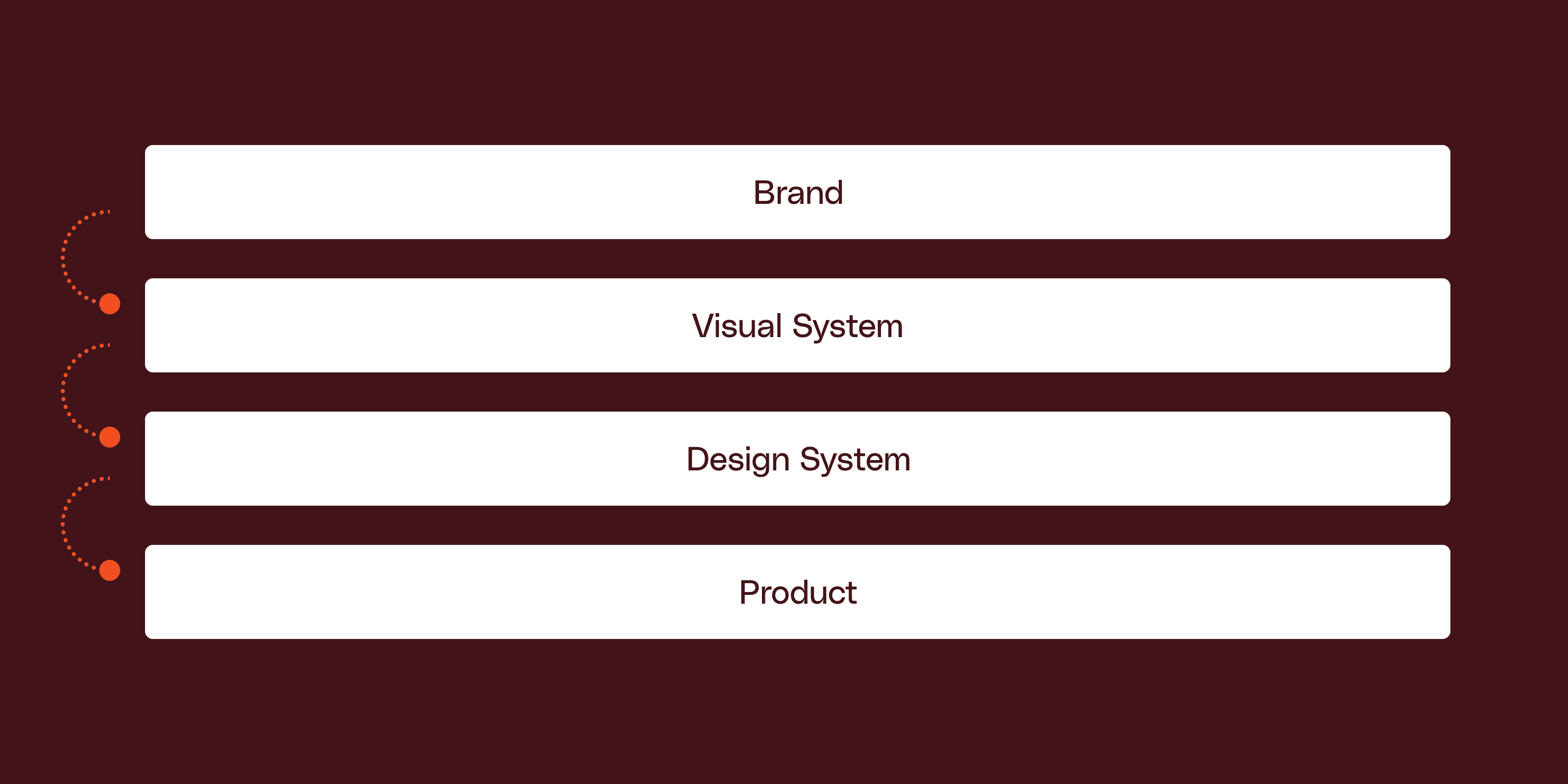
One way to think about a brand and its accompanying design system is that it's a bit like laying infrastructural foundations; you can get by with a brittle backend foundation, but as soon as you try to scale, weak foundations start to reveal problems that ultimately slow things down and lower the quality. Getting that foundation right, and making sure that it is durable and scalable, enables a company to move quickly with a shared voice, and ideally gives you room to flex as you grow and establish yourself. There are also the practical benefits of providing design and engineering with a shared set of principles to align with, which helps with:
- Polish: A consistent look and feel
- Speed: Components that can be quickly implemented across the site
- Alignment: A shared visual language to work against when discussing colors, illustrations, etc.
The brand informs the design system, which then informs the product's look, feel, and UI. And thus we set out to build a brand that the product and team could rally around.
There is another piece to this, though, beyond the purely practical. At the end of the day, any new company and product has a story to tell, and in the consumer space, shaping this narrative early can be key. We wanted to build a brand that resonated with real people and, importantly, from the start, could tell people a bit about who we are and why we're building Yupp, while helping to build trust and credibility.
Getting Started
Practically speaking, it's pretty rare for an early-stage company to have the internal resources to build a world-class brand. There's an unavoidable reality of bandwidth and prioritization, and often, in-house designers need to focus on core product design work, leaving the brand to slip through the cracks. The time required for iterations and some of the specialized skills involved in brand design can significantly benefit from working with an outside partner (and it never hurts to get a fresh set of eyes on things). This can often be the most effective way to flesh out an excellent brand quickly.
In the case of Yupp, we partnered closely with SINK to build our brand and visual identity. They are an outstanding and highly collaborative team used to working with our lead investor, Andreessen Horowitz's portfolio companies, as well as the communications agencies that support a launch like ours.
Having a close partnership with marketing and communications teams (often external) that support a fledgling company goes a long way in creating that seamless moment for an initial launch.
Our brief was straightforward: create a brand narrative & visual identity to introduce Yupp as a consumer product to a global audience. We took the broader AI landscape into account, differentiating ourselves as an approachable, fun, yet highly functional product.
We explored a number of visual territories:
- Direction 1: Yupp as a brand that represents self-actualization, leaning into motifs around education, enlightenment, and human knowledge.
- Direction 2: Yupp as a brand that represents self-determination around a movement, creating a brand that is youthful and expressive.
- Direction 3: Yupp as a brand that represents self-worth, exploring themes around generative imagery and discovery
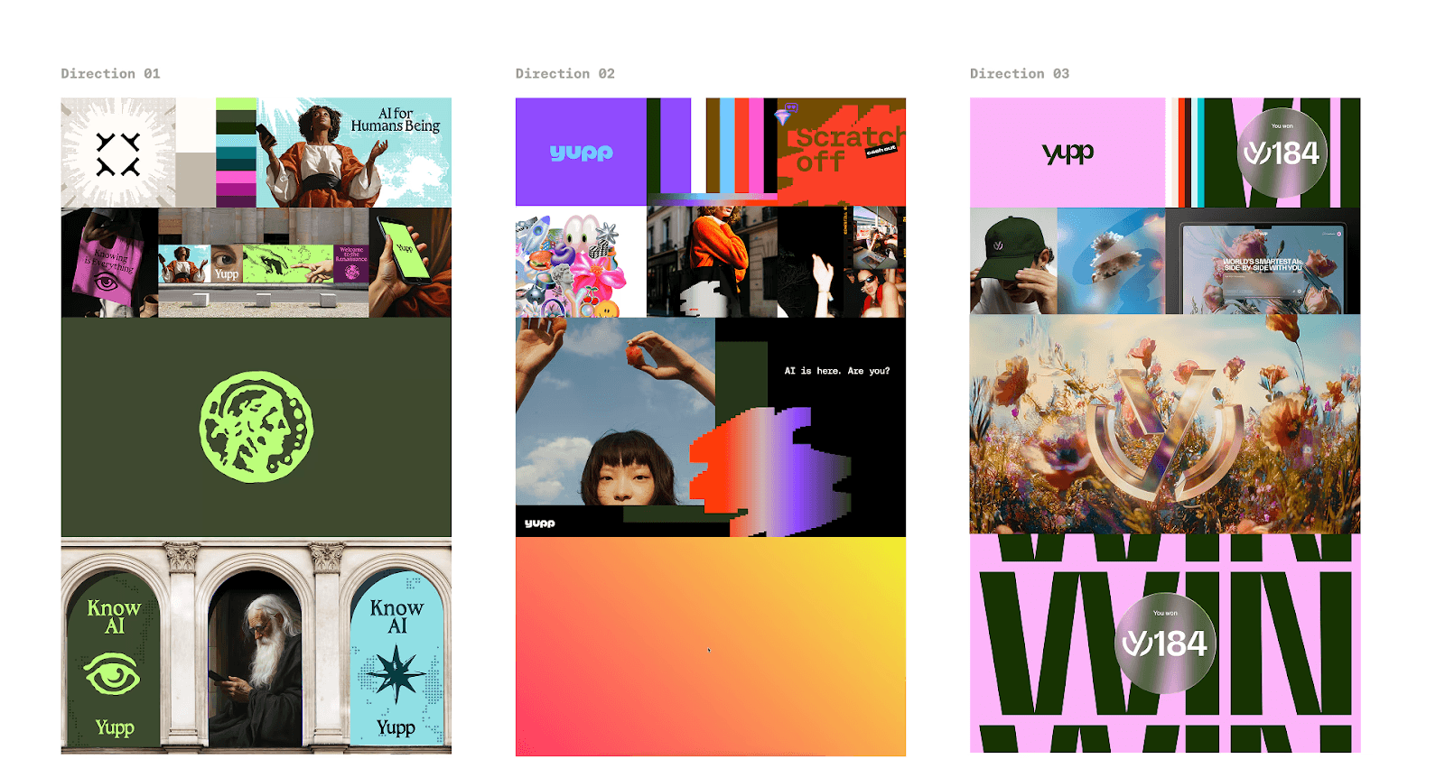
Ultimately, our conversations around these three initial directions led us to a fourth—one that embraced the tension between playful curiosity and functional utility. This final direction expresses Yupp as a brand that embodies human curiosity. It captures the layered intelligence that Yupp seeks to bring together, elevating our curiosity to new heights. We built a visual identity around this spirit of discovery—highlighting contrast, curiosity, and clarity.
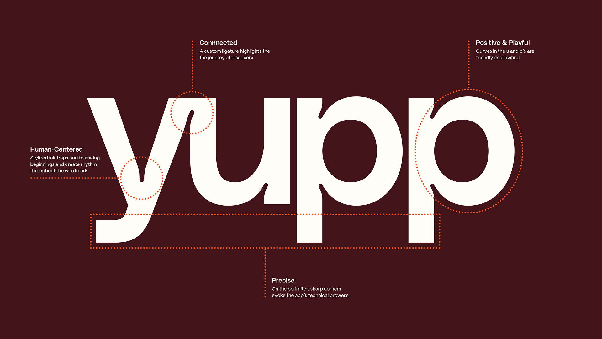
Our wordmark is the first step in achieving this balance, utilizing unexpected inktraps to bring a human touch to otherwise structured and technical letterforms.
Our color palette is grounded in earthy, warm neutrals that feel intrinsically more human than other similar brands, setting the backdrop for unique expressions of light and dark modes. We introduced playful, bright hues and gradients to add pops of vibrancy that reflect our ethos of exploration and discovery.
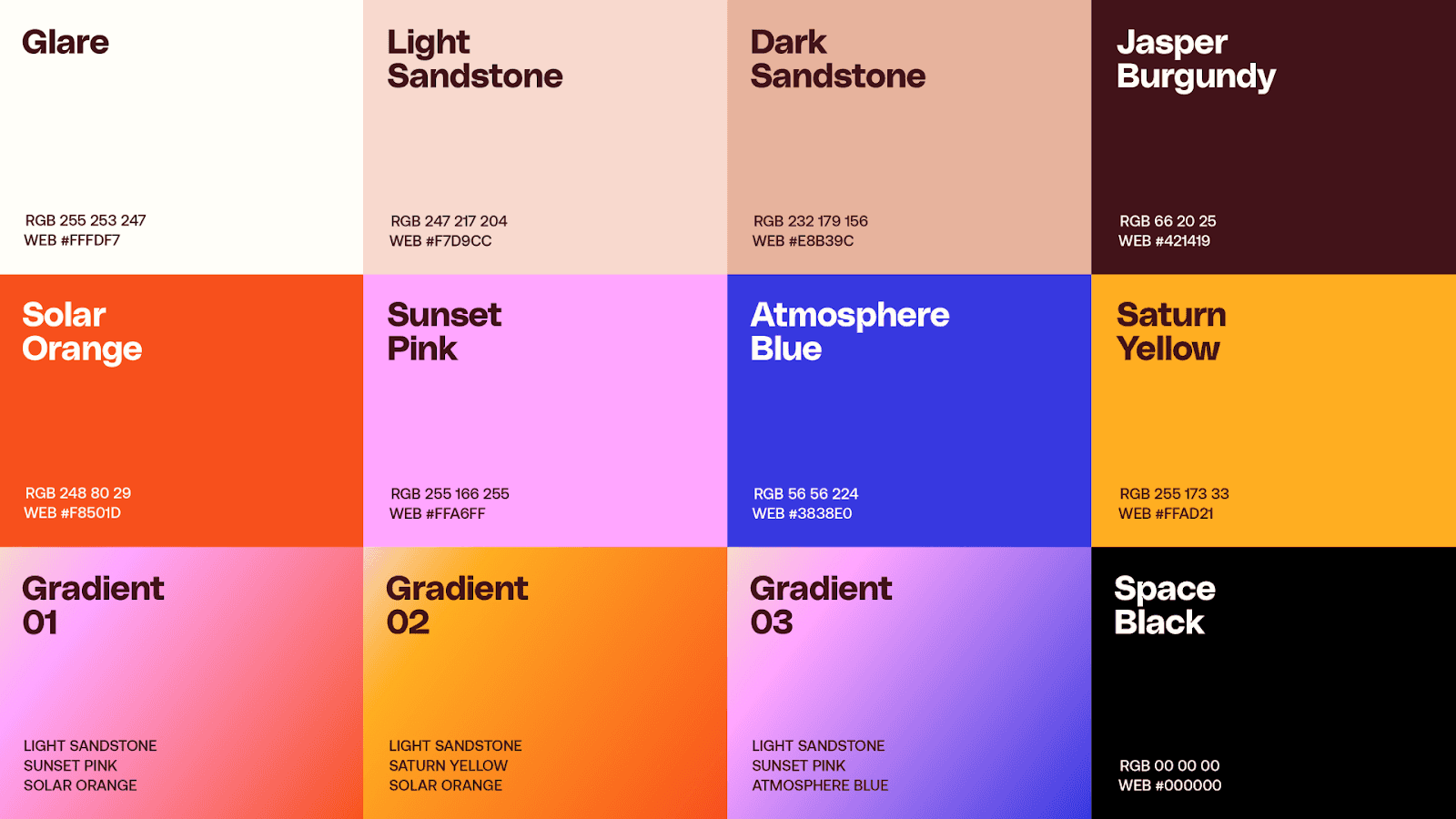
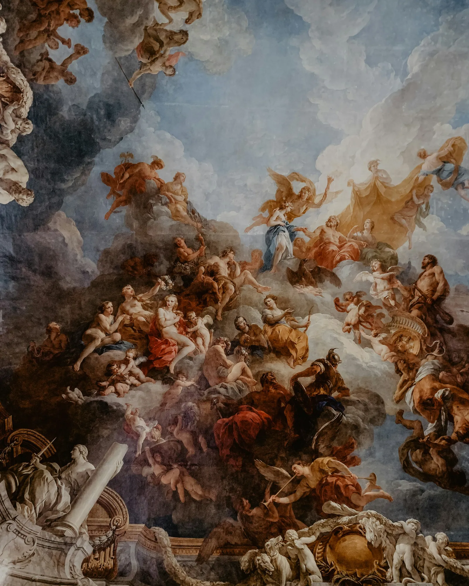
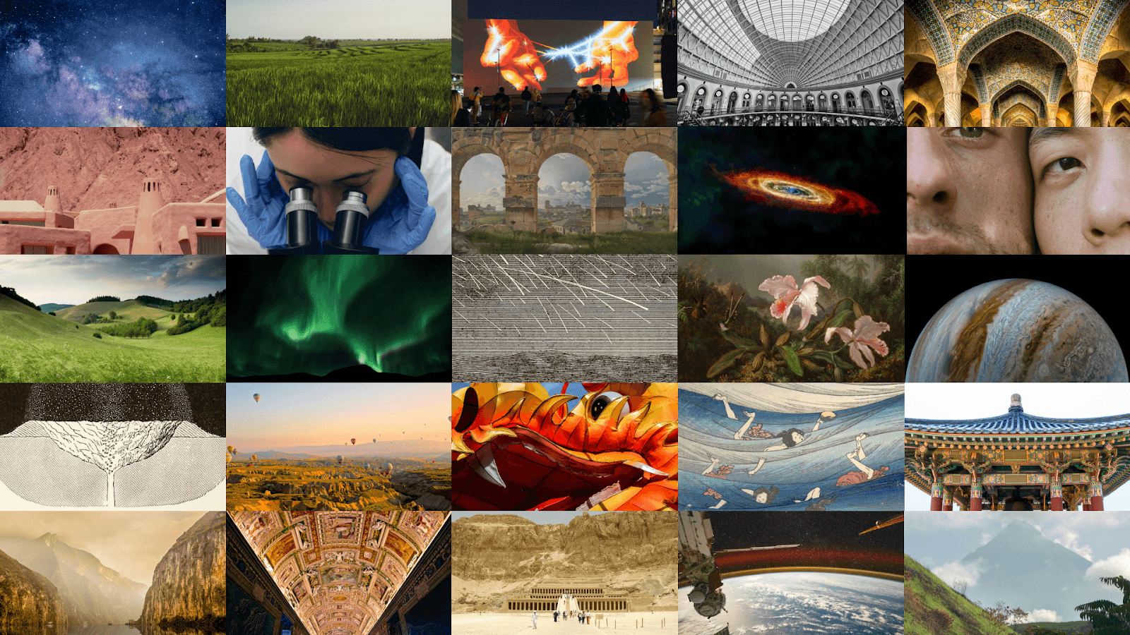
When it came to imagery, we wanted to tell a story that evoked a sense of awe, not inspired by the power of AI, but by the power of humans and the natural world. Every image is sourced from the public domain, honoring the collective nature of Yupp. We aren't creating a fantastical world that lives beyond our own; we're celebrating the tangible present, honoring the past, and dreaming of the future.
Finally, our logo (symbol) serves as a visual metaphor for our composable product. Dynamic cards bring together many LLM models into one world of discovery. You'll see these cards used in several ways within the broader system, as different representations of layers of intelligence, and they are always shown at angles and in formats that convey the movement inherent to the process of discovery.
Ultimately, what did the several weeks of brand exploration and refinement give us? A strong symbol, wordmark, typeface, and color palette that we felt resonated with our users and ourselves.
Putting it together
Landing a brand is one thing, but bringing that visual system, tone, and feeling into a product is a whole different ball game. We had a tight timeline: roughly two weeks to figure out how to take the artifacts from our brand and build a new design system for the product, ultimately fundamentally reimagining the look and feel of Yupp. Our in-house designers drove this process, but it was largely collaborative with SINK working alongside and collaborating on different ideas and concepts. Pretty much every detail, from the basics like typography and color, to our core building block components like buttons and fields, and even our richer elements like response cards, prompt box, and navigation, underwent a complete, end-to-end overhaul. Our team was ready to handle this challenge. Our base system was well-prepped in Figma and production, allowing us to apply updates quickly ( although "best laid plans," so the idiom goes ). This was a real testament to the collaborative spirit at Yupp and the talent of our engineers and designers to stick the landing here.
We had some puzzles to work through on the design side, though, and color was one of the trickier ones given the tight time box. We had previously done a palette refresh about two months prior, so the good news was that the token architecture and general challenges of color application were still fresh in our minds. Our general approach was to keep a stark contrast between elements relatively reserved, to give a very clear visual hierarchy of what is most important at given moments, which lends our palette a relatively wide range of subtle background shifts for elements that simultaneously do need enough differentiation to stand out from each other while also not competing for focus.
This, coupled with our new baseline brand colors having a relatively novel baseline of beige and brown rather than the more standard greys often seen, meant we had to roll up our sleeves and conduct a series of revisions and explorations to see what felt right. Lo and behold, the magic moment where this felt right to the team came quickly, and the aforementioned systems work the team had done allowed for extremely rapid iteration on palette.
This combination of factors enabled us to develop a general color application that feels unique on the product side while maintaining the sense of simplicity and focus we aim for in our core experience, and aligns with the brand direction we had established. Things felt unified. Once the brand system was in place, the next challenge was translating it into tangible user experiences.
Signature Moments
We've touched on the system-level work a bit, but our brand really comes alive in a couple of key signature moments within the product. This speaks to a general principle we have regarding a 'gradient of expressiveness' in our product. Our voice should be minimized in our more functional moments, but we should find graceful ways to make a moment feel special and more interesting (dare I say, fun) for the user when it's appropriate. Let's dig into a few of those moments.
Onboarding
Onboarding is one of the first and most important moments where you get to tell your product and company story. First impressions matter, and people do judge a book by its cover. We had a fairly reasonable onboarding experience before launch, which was very functional, with a "tell over show" approach. We took a step back and wanted onboarding to draw people into the product; walking them through the process of asking a prompt and getting rewards for providing feedback was the most direct way we could onboard users. Still, we also wanted to keep things focused and simple, so users could quickly access the core experience.
Rather than leaning into a heavier marketing site for the homepage, we felt that our narrative was most effectively conveyed by getting people in the door; however, we still wanted to have that big branded moment on first launch. Loading Yupp and seeing the symbol and collection of top models helped land the brand's identity and seamlessly bring people into the product.
The onboarding process is highly functional; preliminary metrics, such as drop-offs and subsequent retention, are pretty healthy with our new guided flow. When considering the friction compared to a simple sign-in, the brand's expressiveness and the handholding of users through their first prompt have exceeded our expectations (and to some degree, created a deterrent for spam).
Making it Move
Once you get into the product, you may notice our general principle around motion and having clear, fluid transitions between states. We have a long road ahead of us on this, but a key way we look to inject a sense of playfulness around discovery is through the thoughtful use of motion. Beyond just introducing a friendlier, warmer tone and a higher degree of polish, clear motion between states and new elements that instantiate serves a functional purpose, helping connect one state to the next and giving a clearer sense of progression through a flow or interaction. That said, we also want to ensure that our approach is accessible and works with a high degree of clarity in conditions where motion isn't ideal or viable; it is additive to our general approach to architecture, rather than something it fundamentally relies on.
Preference Feedback and Scratch Card
A final piece of the puzzle is our preference feedback UI and rewards flow, culminating in the scratch card. A key tenet of our evaluation flow is that we aim to avoid making things feel overwhelming to the user and prioritize simplicity, introducing progressive disclosure as needed to accommodate added complexity. This general practice is fundamental to our product design approach moving forward, emphasizing a focus on the task at hand and exposing just enough to strike a balance between functionality and clarity. As the final part of the evaluation flow, we aimed to make the reward moment feel interesting and ultimately fun, so we designed a scratchcard-based interaction to create a small moment of anticipation and surprise. One of the challenges in integrating our brand into our product was finding suitable moments to showcase photography. With scratchcards, we found that introducing randomized photos from our collection helped add to the fun factor and connected back to our brand in a simple and effective way (more to come on both this and photography usage at large).
We have a long and exciting journey ahead of us on design at Yupp, and it is a fundamentally important part of what we value as a company and our general product strategy. All three features, including updated ratings and scratch cards, are now live in the product as of today.
Looking Forward
Yupp's process of building out a visual identity and bringing it to life through our product is a journey that many early-stage teams can draw from in their own endeavors. Our journey of building our brand foundation and developing these signature moments of expressiveness has provided real ROI for the business, but more importantly, has given us a coherent and durable way to build a product that resonates with our users and provides a path forward for many future iterations of Yupp.
We're just getting started—and can't wait to share what's next for design at Yupp. We are also hiring a great Product Designer to join us in our journey.